
USER MANUAL ANALYTICS
User Manual - Analytics Bot System --- Introduction The Analytics system is a platform that allows monitoring and analyzing the performance of the conve...
User Manual - Analytics Bot System
Introduction
The Analytics system is a platform that allows monitoring and analyzing the performance of the conversational bot. The interface provides a comprehensive view of interactions, handovers to operators, lead conversions, and session flows.
Main Features
- Interactive graph visualization for analyzing bot performance
- Handover analysis to monitor transitions to human operators
- Session tracking with detailed metrics
- Sankey diagrams to visualize session flows
- Download custom reports in Excel and CSV format
- Time range selection with predefined and custom ranges
Accessing the System
Access URL
The application is accessible via the Crafter platform URL. After authentication, the user is redirected to the main dashboard.
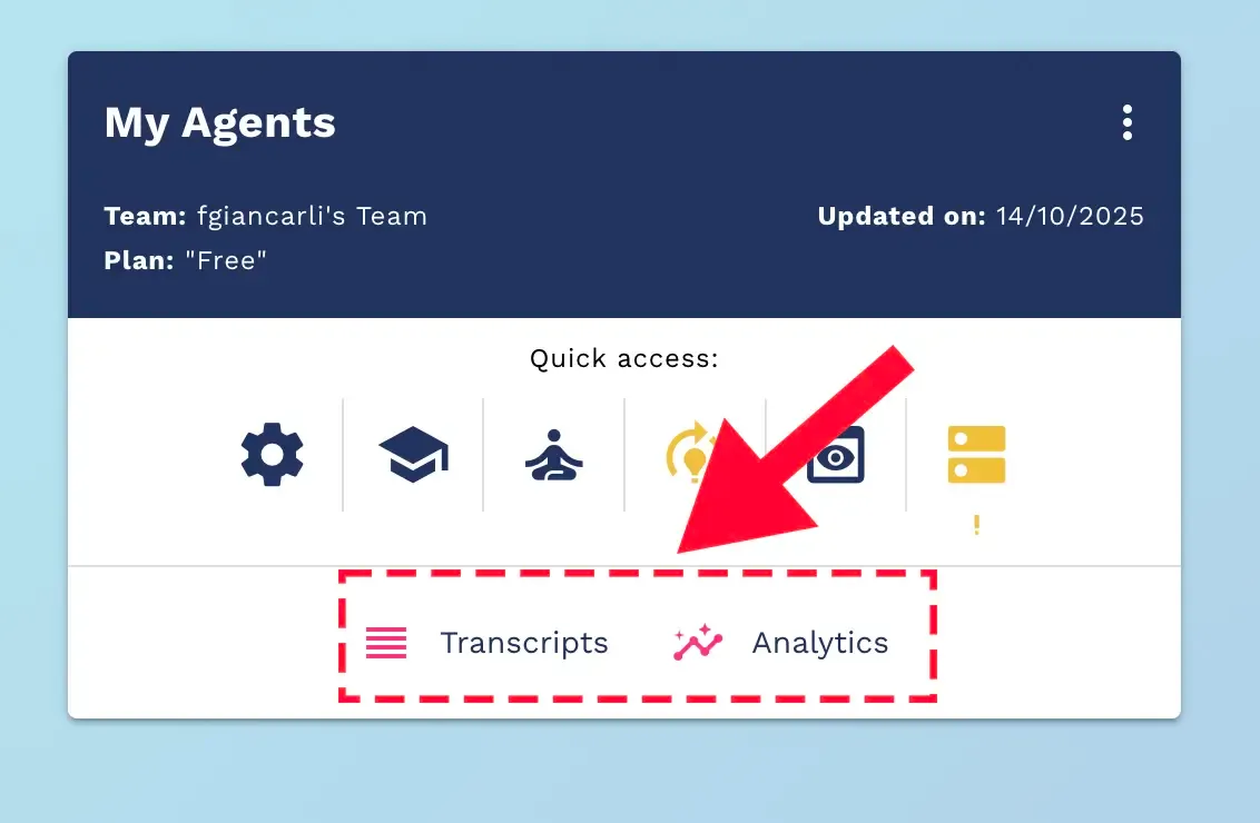
Authentication
The system uses a token-based authentication mechanism with automatic refresh to ensure persistent sessions without interruptions.
Supported Languages
The interface is available in three languages:
- Italian (it-IT) - default
- English (en-US)
- Brazilian Portuguese (pt-BR)
The interface language can be changed from the user menu in the top toolbar.
Main Interface
Layout
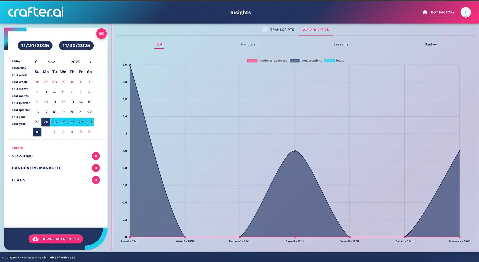
The interface consists of:
- Top toolbar - contains the logo, application title, and user menu
- Sidebar (HUD) - date selector, totals, and controls
- Main area - graph visualization and analytics tabs
- Footer - copyright information
Navigation
The main navigation includes two tabs:
- Transcripts - viewing and searching sessions
- Analytics - graph visualization and metrics (focus of this manual)
HUD (Heads-Up Display)
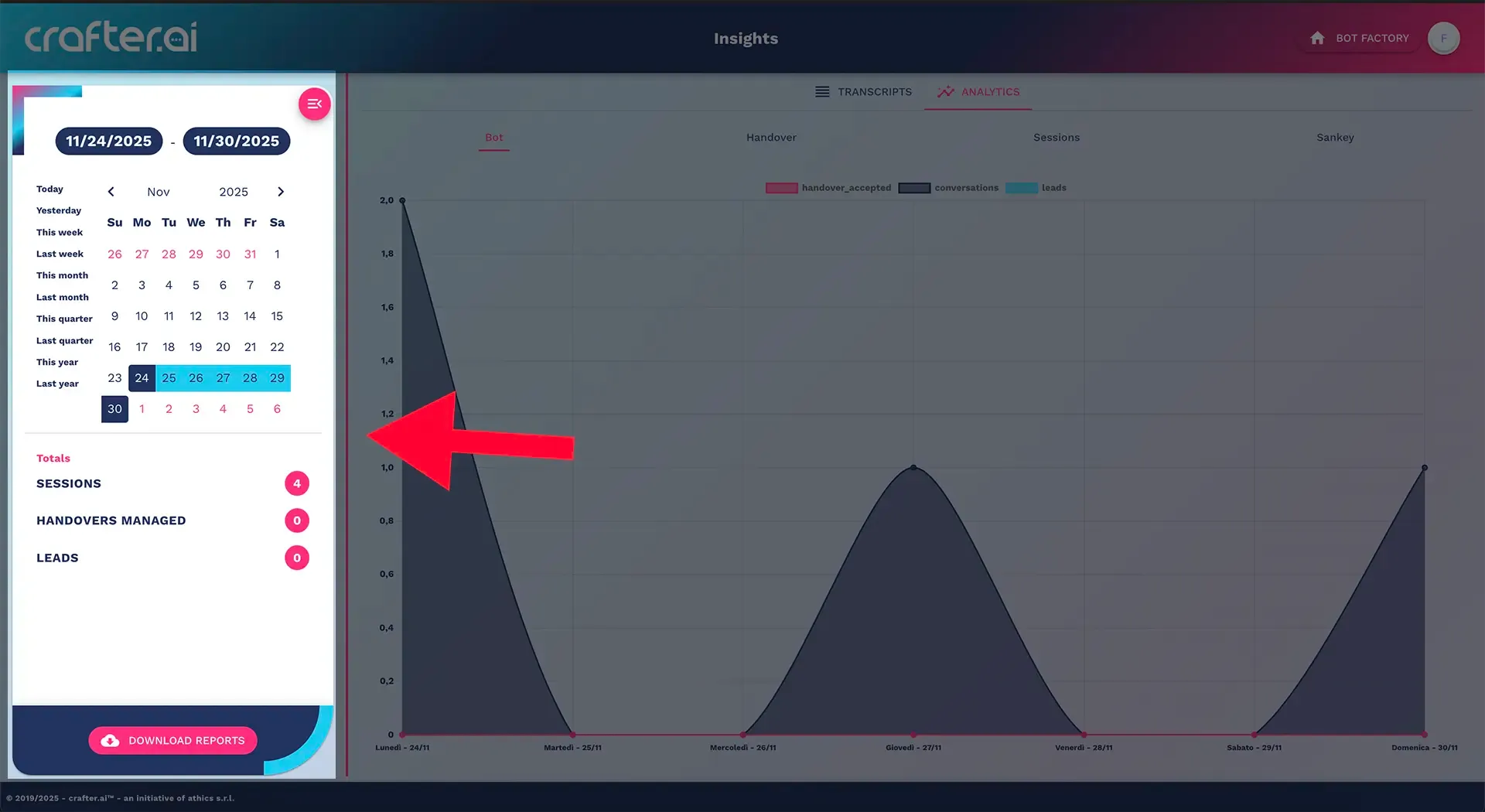
The left sidebar is always visible and contains:
- Time range selector with interactive calendar
- Total visualization (when available)
- Download report button to export data
The panel can be closed/opened via the menu button at the top left.
Time Range Selection
Date Picker
The interactive calendar allows selecting a custom time range for data analysis.
Features
- Date range selection - click on the start and end dates to define the range
- Current view - selected dates are shown in badges at the top
- Date format - DD/MM/YYYY for Italian, MM/DD/YYYY for English
- Auto-apply - changes are automatically applied to the selection
Predefined Ranges
To speed up selection, the following predefined ranges are available:
| Range | Description |
|---|---|
| Today | Current day |
| Yesterday | Previous day |
| This week | From Monday to Sunday of the current week |
| Last week | From Monday to Sunday of the previous week |
| Current month | From the first to the last day of the current month |
| Last month | Entire last month |
| Current quarter | The three months of the current quarter |
| Last quarter | The three months of the previous quarter |
| Current year | From January 1 to December 31 of the current year |
| Last year | From January 1 to December 31 of the previous year |
Behavior on Date Change
When changing the time range:
- Automatic loading - the system shows a loading indicator
- Data update - data is reloaded for the new range
- Graph refresh - the graph is regenerated with the new data
- Total update - metrics in the HUD panel are recalculated
Note: The timezone used is that of the user's browser
Analytics Sections
The Analytics tab is divided into four main sections, accessible via horizontal tabs.
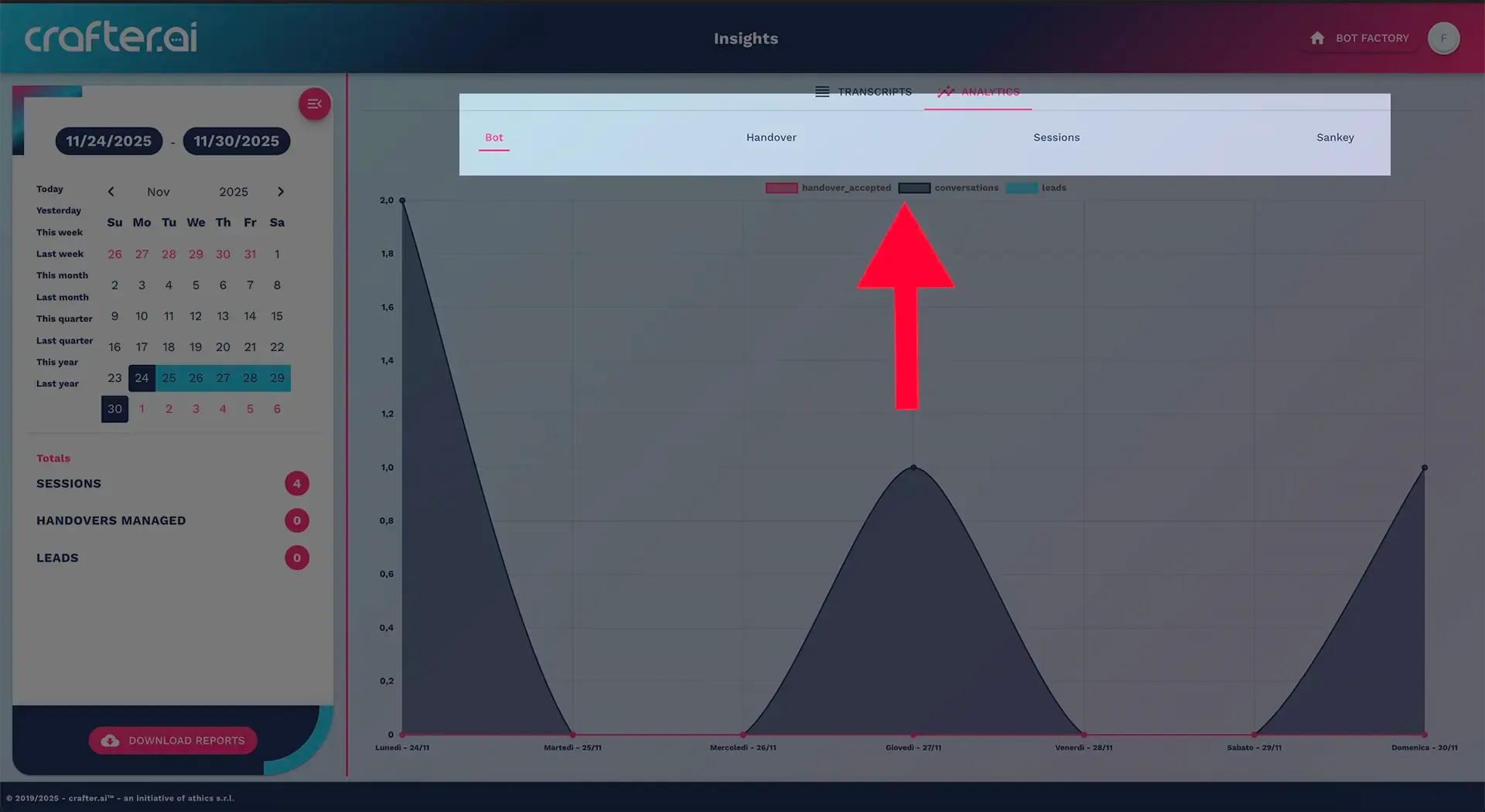
1. Bot
Displays the overall metrics of the bot for the selected period.
Available Graphs
- Line graph showing the temporal trend of metrics
- Multiple series to compare different metrics
- Filled lines to highlight areas under the curve
Displayed Metrics
The exact metrics depend on the bot configuration but typically include:
- Total number of sessions
- Sessions with at least one message
- Sessions without messages
- Total number of messages
- Leads generated
Available Totals
The sidebar shows aggregated totals for:
- Sessions
- Managed Handovers
- Leads
2. Handover
Detailed analysis of the bot's transitions to human operators.
Available Graphs
Temporal trend visualization of handovers distinguishing between:
- Explicit handovers - directly requested by the user
- Proposed and accepted handovers - suggested by the bot and accepted
- Generated handovers - total handovers triggered
- Managed handovers - taken over by an operator
- Unmanaged handovers - left unanswered
Available Totals
- Explicit (total_explicit)
- Proposed Accepted (total_proposed)
- Generated Handovers (total_handovers_triggered)
- Managed (total_managed)
- Unmanaged (total_unmanaged)
Colors
- Accepted Handovers: Pink (#FF2D7D)
- Unmanaged Handovers: Primary Blue (#22325d)
3. Sessions
Provides a comprehensive view of the conversations managed by the bot.
Available Graphs
Temporal trend focusing on:
- Sessions with at least one message
- Sessions without messages
- Total number of messages
- Consecutive misses (when the bot fails to respond)
Available Totals
- Sessions with at least one message (conv_con_almeno_un_mess)
- Sessions without messages (total_conv_no_mess)
- Messages (total_messages)
- Misses (total_misses)
Colors
- Sessions: Primary Blue (#22325d)
- Misses: Pink (#FF2D7D)
4. Sankey
Advanced visualization of session flows through a Sankey diagram.
Features
The Sankey diagram is a type of chart that shows the flow from a series of source nodes to a series of destination nodes.
- Flow visualization - shows how users move through the bot
- Source nodes - represent the starting points of conversations
- Destination nodes - represent the endpoints or actions
- Link width - proportional to the volume of flow
Colors
- Flow from: Pink (#FF2D7D)
- Flow to: Primary Blue (#22325d)
Usage
This visualization is particularly useful for:
- Identifying the most common user paths
- Spotting bottlenecks in the conversational flow
- Optimizing the bot's decision tree
- Understanding where users drop off in the session
Color Scheme
The system uses a consistent color palette:
- Primary (#22325d): Dark Blue
- Secondary (#FF2D7D): Pink
- Accent (#14CDF0): Light Blue
Totals and Metrics
Total Visualization
In the sidebar HUD, below the date selector, the totals of metrics for the selected period are displayed.
Display Format
- Values < 100: shown in a colored circular avatar
- Values ≥ 100: shown in a wider rounded badge
Color
All totals use the secondary color (pink #FF2D7D) for visual consistency.
Automatic Update
Totals are automatically updated when:
- The time range is changed
- Switching from one analytics section to another
- The page is reloaded
Download Report
Accessing Reports
The button for downloading reports is available in the footer of the HUD panel, identified by the cloud_download icon and the label "Download reports".
Types of Reports
Clicking the button opens a menu with available reports:
Standard Reports
Standard reports are always available and typically include:
- Conversation reports
- Handover reports
- Lead reports
- Message reports
Each standard report is identified by:
- Representative icon
- Descriptive label
- Dedicated API endpoint
Custom Reports
The platform offers the possibility of having custom reports based on specific company requests.
They are highlighted with:
- Accent background (light blue #14CDF0)
- Custom icon
- Label defined by the administrator
Export Formats
For each report, you can choose between two formats:
- Excel: ".xlsx"
- CSV: ".csv"
Download Process
- Select range - ensure the dates are correct in the date picker
- Click the button - open the download report menu
- Choose report - select the desired report
- Choose format - click on "xlsx" or "csv"
- Wait for processing - the system shows a loading indicator
- Automatic download - the file is automatically downloaded in the browser
Report Content
Reports include:
- Raw data filtered for the selected time range
- Timestamp with the user's timezone
- Metadata about the conversations (ID, channel, page, etc.)
- Aggregated metrics when applicable
Glossary of Metrics
General Bot Metrics
| Metric | Description |
|---|---|
| Sessions | Total number of unique session sessions initiated during the period |
| Sessions with messages | Sessions in which at least one message was sent |
| Sessions without messages | Open sessions but without message exchange |
| Messages | Total number of exchanged messages (bot + user) |
| Leads | Number of completed lead conversions |
Handover Metrics
| Metric | Description |
|---|---|
| Managed Handovers | Total handovers taken over by operators |
| Explicit | Handover explicitly requested by the user |
| Proposed Accepted | Handover suggested by the bot and accepted by the user |
| Generated Handovers | Total number of triggered handovers |
| Managed | Handover responded to by an operator |
| Unmanaged | Handover left unanswered |
Quality Metrics
| Metric | Description |
|---|---|
| Miss | Number of times the bot failed to provide an adequate response |
| Consecutive Misses | Sequences of consecutive misses in the same session |
Technical Features
Interactive Graphs
The graphs use the Chart.js library with the following features:
- Font: Work Sans (bold)
- Animations: smooth transitions between data changes
- Responsive: automatic adjustment to screen size
- Curve tension: 0.25 for smooth lines
- Fill opacity: 0.6 (60%)
Performance
The system implements several optimizations:
- Lazy loading: data is loaded only when necessary
- Graph destruction: previous graphs are removed before rendering new ones
- Rendering timeout: 100ms delay to ensure complete data loading
- Prevention of duplicate loads: isLoading flag to avoid simultaneous multiple requests
Handling Empty Data
When no data is available for the selected period:
- A visual feedback "No data available" is shown
- A suggestion invites to modify the time range
- Graphs are not rendered (avoiding errors)
- Totals are not displayed in the HUD panel
Timezone
All dates and times respect the user's browser timezone.
Best Practices
For Analysis
- Start with short intervals (week/month) for detailed analysis
- Compare similar periods (same week of different months) to identify trends
- Analyze all tabs for a complete view of performance
- Export reports regularly for historical analysis
- Monitor unmanaged handovers to improve customer service
For Performance
- Avoid overly long intervals (> 1 year) to keep graphs readable
- Wait for complete loading before changing tabs
- Do not quickly modify dates to avoid multiple requests
For Reports
- Choose Excel for complex analyses with formulas
- Choose CSV for integrations with other systems
- Always check the time range before downloading
- Document exported reports with date and context
Support and Assistance
Troubleshooting Common Issues
The graph does not load
- Check the internet connection
- Ensure there is data for the selected period
- Try reloading the page
The report download does not start
- Check the internet connection
- Ensure there is data for the selected period
- Try reloading the page
- Check available disk space